
Web Design & Development Services
Professional, responsive websites built for performance, visibility, and results

In today's digital-first world, your website is more than just a virtual storefront - it is the central hub of your brand, your services, and your communication. At Chokware, we create bespoke websites that not only look beautiful but are also engineered for growth, accessibility, and discoverability.
We are based in Umeå, Sweden, but we proudly deliver professional websites to clients in any country, providing the same care and attention wherever you are.
Our approach is grounded in a deep understanding of both technology and user experience. We do not just design - we build solutions that solve real problems, attract meaningful traffic, and help your business grow online.
Tailored web design that reflects your brand
Every business is unique, and your website should reflect that. We do not use one-size-fits-all templates. Instead, we design each site from the ground up, focusing on your identity, goals, and users. Our team works closely with you to understand your brand values, visual preferences, and the message you want to communicate.
From clean corporate websites to creative portfolios or complex service platforms, we shape every element to suit your tone and aesthetic. Your website will not only look professional, but will also feel like a natural part of your business.

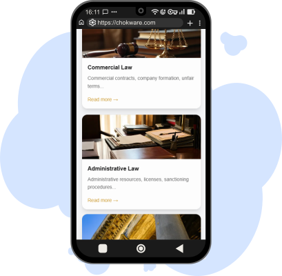
Responsive design for all devices
With mobile usage now surpassing desktop, responsiveness is essential. Every website we build is designed and tested to work smoothly across smartphones, tablets, laptops, and desktops. We use a mobile-first development approach, ensuring the layout, navigation, and performance are optimised from the smallest screen upwards.
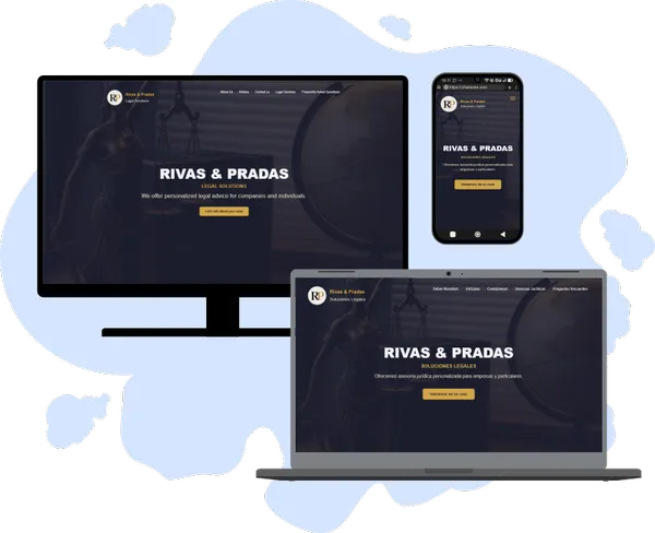
A consistent experience on any device improves user satisfaction and strengthens your position in search engines, which increasingly prioritise mobile usability.
SEO-optimised code and content
A well-designed website means little if it cannot be found. Search Engine Optimisation (SEO) is central to every project we deliver. From semantic HTML and clean URLs to schema markup and fast-loading assets, our sites are built with SEO best practices from the beginning.
We also assist with keyword strategy, metadata, and content hierarchy to ensure your website communicates effectively with both your audience and search engines. A strong SEO foundation means long-term visibility and sustainable growth.
Fast and lightweight performance
Speed matters. It affects how your site ranks in search results and how visitors engage with it. Just a few seconds of delay can increase bounce rates and reduce conversions. That is why we prioritise performance in every project.
We follow best practices such as image optimisation, code minification, intelligent caching, and modern frameworks to ensure fast loading times - even on slower connections. Whether your audience is browsing on mobile data or fibre broadband, they will have a smooth experience.
Built for accessibility and inclusivity
Modern websites should be usable by everyone, including people with disabilities. Accessibility is a priority in our development process from the very beginning. We follow global standards like WCAG and include features such as keyboard navigation, proper colour contrast, and screen reader compatibility.
Accessible websites are not only ethically important - they are also a legal requirement in many regions and improve SEO and user trust. Our commitment to inclusive design ensures that your website is open to the widest possible audience, without sacrificing design or functionality.
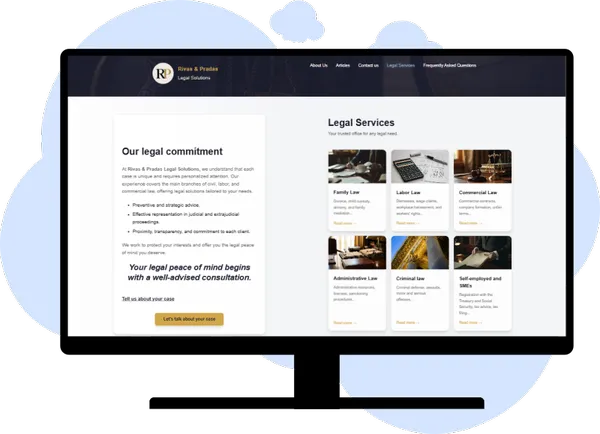
User experience that engages and converts
We do not just create websites that work - we design experiences that work for your users. Our team focuses on intuitive, user-friendly interfaces that guide visitors towards taking meaningful action. Whether that is making contact, booking a service, or learning more about what you offer, we design with clarity and purpose.
We apply proven UX principles to structure content, highlight key messages, and make navigation feel effortless. The result is more time spent on your site, stronger engagement, and higher conversion rates.
Scalable and future-ready
Technology evolves quickly, and your website should be ready to grow with it. Our code is clean, modular, and built for expansion. Want to add a blog, online booking, e-commerce, or a user portal in future? No problem - we build with that flexibility in mind.
We also offer ongoing support and maintenance so your site stays secure, up to date, and aligned with current best practices.
Built with modern tools and frameworks
We use stable, modern technologies to ensure long-term security, maintainability, and performance. Whether you need a lightweight static site, a CMS like Statamic or WordPress, or a custom Laravel backend, we choose the tools that best suit your needs.
Our tech stack is optimised for reliability and developer efficiency, allowing us to deliver faster without compromising quality.
Transparent process and communication
From first consultation to final launch, we keep you informed and involved at every step. We explain our process clearly and provide honest advice tailored to your goals and budget. No jargon. No surprises. Just open communication and professional delivery.
Why choose Chokware?
- Over five years of experience in full-stack development
- Specialists in Laravel, Vue.js, and scalable architectures
- Custom solutions - not off-the-shelf templates
- Committed to accessibility, speed, and usability
- Based in Umeå, Sweden - working with clients worldwide
We are more than developers - we are your digital partners. Our goal is not just to launch your site, but to help your business succeed online.
Ready to elevate your online presence?
Whether you are starting from scratch or want a site that performs better on mobile and in search, we are here to help.
Contact us today and let us build a website that works as hard as you do.
Terminology
- WCAG - Web Content Accessibility Guidelines
- SEO - Search Engine Optimisation
- CMS - Content Management System
- UX - User Experience
- Responsive Design - Design that adapts to all screen sizes
- Schema Markup - Structured data to help search engines interpret your content
- Mobile-First - An approach to design and development prioritising mobile usability